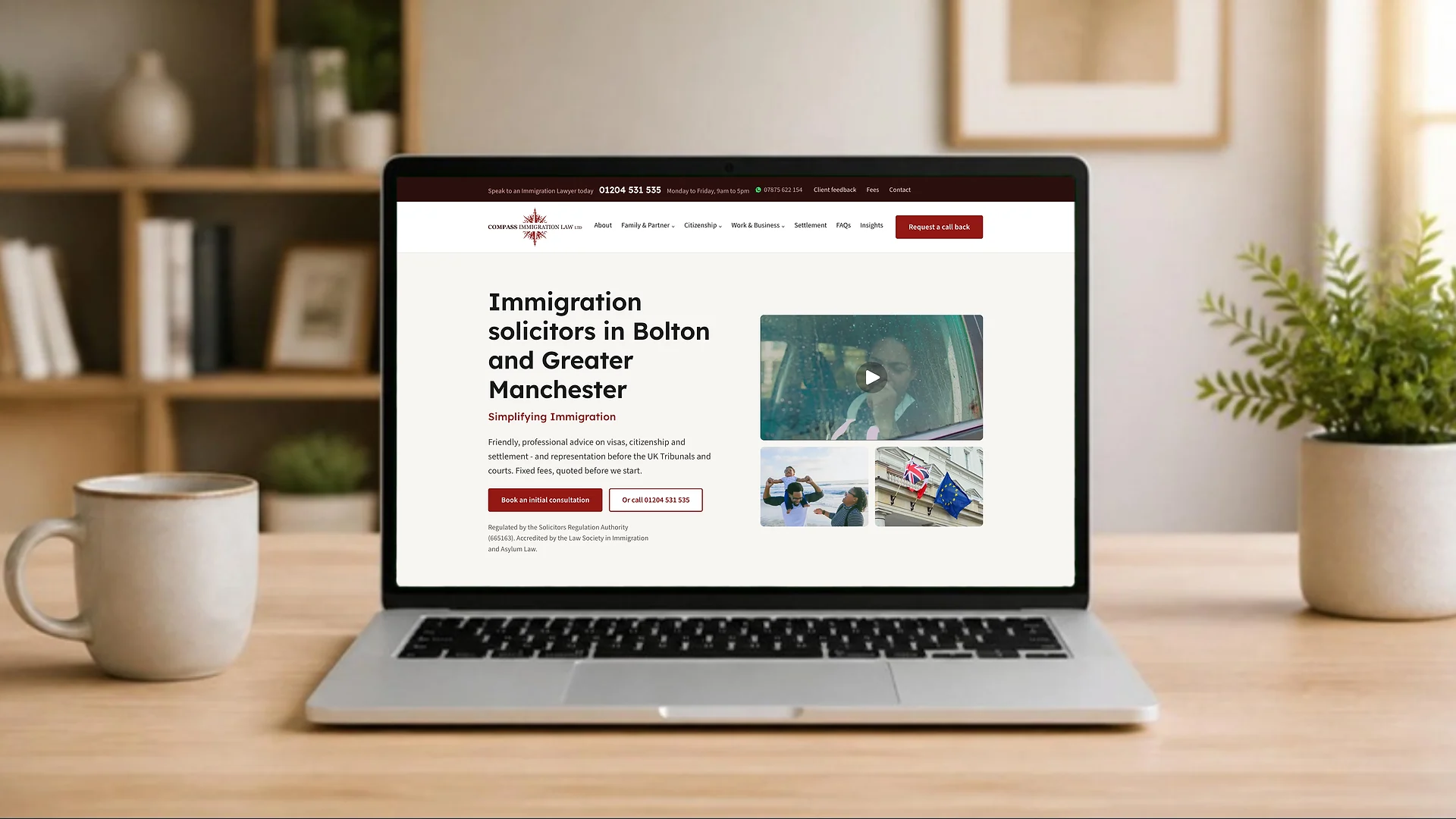
Compass Immigration Law is an SRA regulated practice in Bolton, acting for families, workers and employers across Greater Manchester and the rest of the UK. Their old WordPress site had served them for years, but it had grown the way most practice sites do: short pages, generic titles and very little that told a worried visitor what would actually happen next.
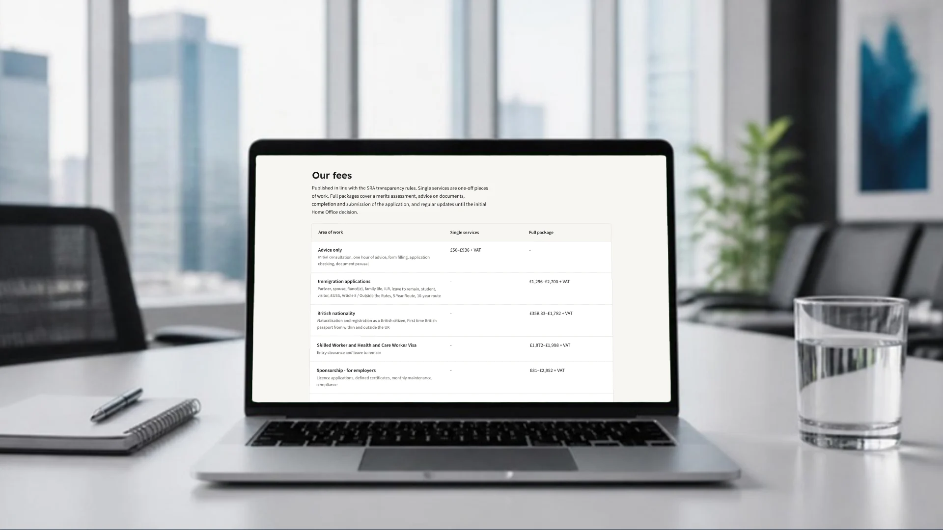
The brief was a site that does the first part of the job a good solicitor does on the phone. Explain the route plainly. Say what it costs. Say what it cannot do. Then make it easy to take the next step.
Built for the reader, not the firm
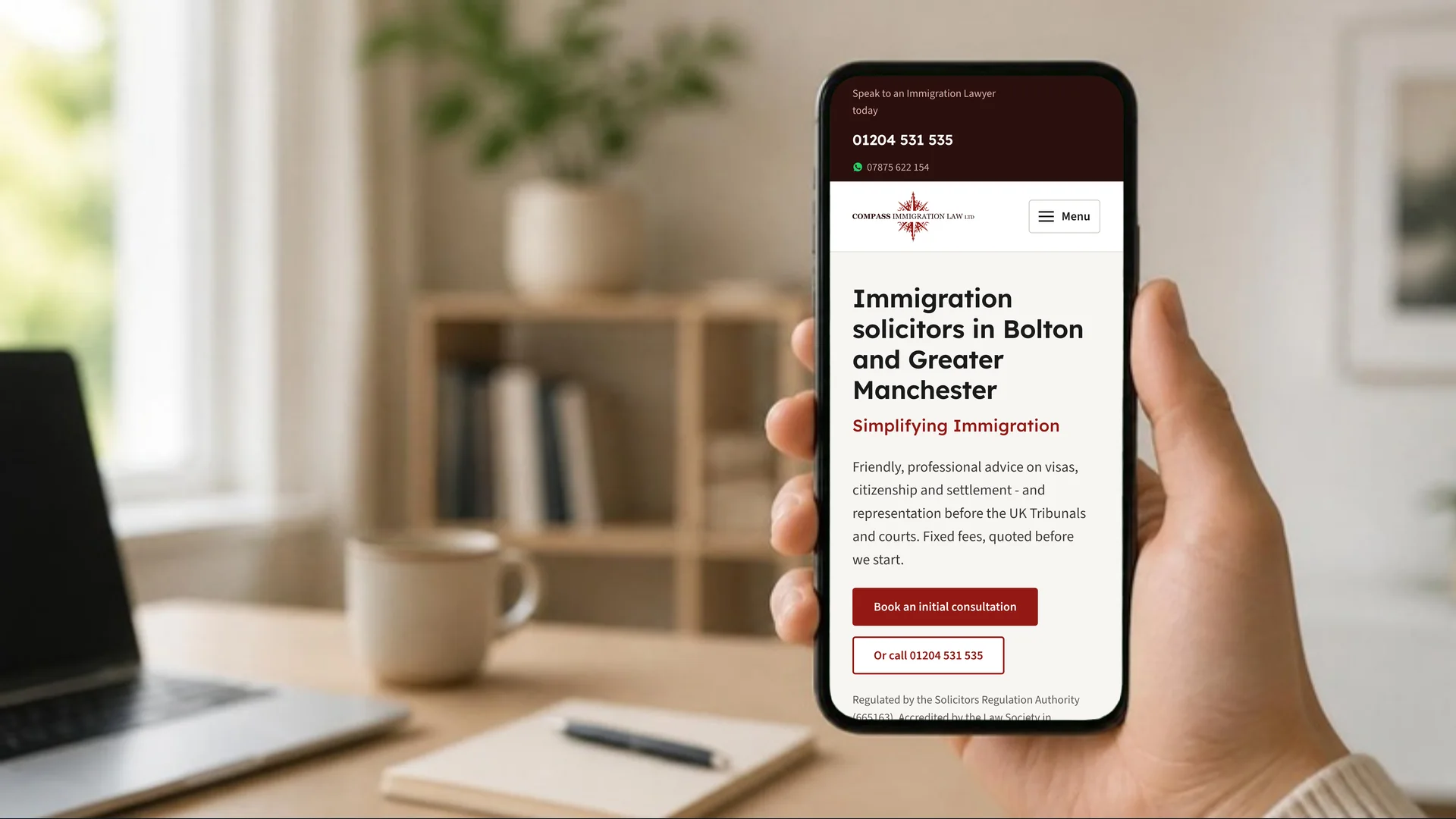
Immigration clients are often anxious and often reading in their second language. That shaped every decision. Short sentences and plain words throughout. One clear call to action per section, never three. No urgency, no “act now”, no outcome guarantees, because a regulated solicitor cannot make them and readers can tell when someone is trying to.
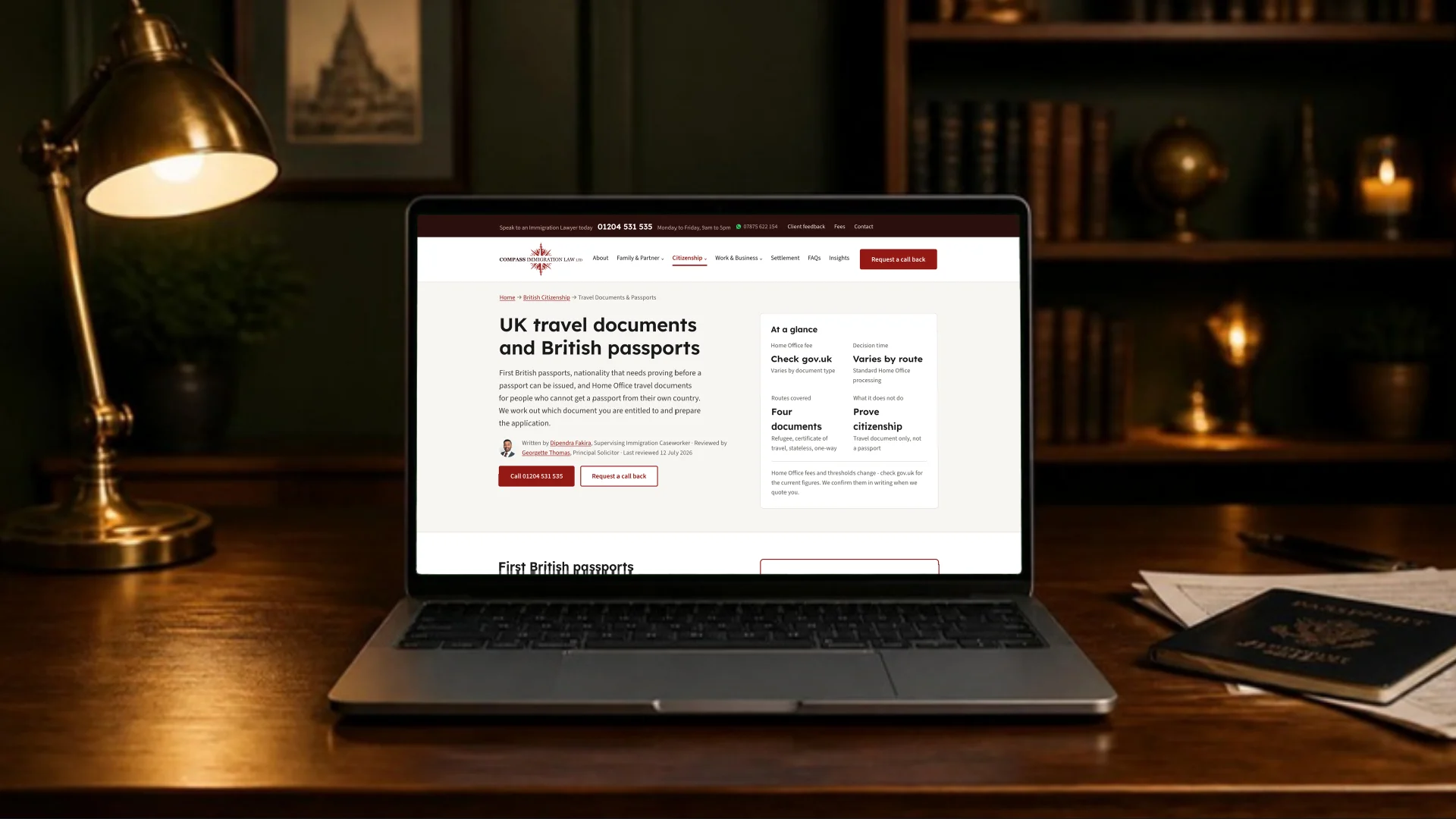
The site is organised around the four things people come for: family and partner visas, British citizenship, settlement and business immigration. Each service page carries an at-a-glance panel, a named author, a reviewing solicitor and a last-reviewed date. Fees are published in full. Bolton and Manchester each have their own page, written for people searching locally.
A migration that keeps what already works
The riskiest part of any rebuild is the day it goes live. Rankings built up over years can disappear overnight if old addresses break or the domain changes.
Before launch we mapped every URL on the old site, and every URL Google had shown in Search Console over the previous 16 months, to its new home. One page, on UK travel documents and British passports, was bringing in most of the firm’s search visitors on its own. Its new title and heading were rewritten around the exact searches that page already ranked for, so the move made it stronger rather than starting again.
We also kept the domain exactly as Google, the Google Business Profile and the regulator listings already knew it. On launch day all 35 legacy URLs were checked against the live site: every one landed on a working page. Asylum work, which the firm no longer offers, was redirected away cleanly rather than left to generate enquiries the practice cannot take.
Fast, accessible and careful with data
The site is built on Astro and served from Cloudflare as static pages. In Lighthouse it scores 100 for Performance, Accessibility, Best Practices and SEO, with the main content painting in half a second. Fonts are self-hosted, images are resized at build time and nothing from Google loads until a visitor has agreed to it in the cookie banner. Day-to-day visitor numbers come from Cloudflare’s cookieless analytics instead.
Enquiries go where the firm already works. The full matter intake hands off to their existing case intake system, while short call-back and newsletter forms run through our own forms service, so the team keeps one inbox and one process.
What it adds up to
A legal site does not need to be clever. It needs to be clear, current and quick, and it needs to protect the search presence the practice already has. Compass now has a site that explains its work in the way its clients need to hear it, publishes its prices and loads before a worried visitor has time to give up.
If your practice’s website was built for the firm rather than the people looking for help, get in touch and we will show you what we would change first.